Moving from a validated model in a notebook to a trusted KPI in a Tableau, Power BI, or Looker dashboard requires a production-grade pipeline. This involves connecting your model scoring service—whether a batch job in Databricks or a real-time endpoint in Azure ML—to the BI platform's data model. The integration surfaces at three key layers: 1) Datasets & Dataflows, where predictions land as new tables or columns; 2) Semantic Models, where measures and dimensions are defined in LookML, Tabular Editor, or Tableau's Data Model; and 3) Dashboard Objects, where scores are visualized as gauges, trend lines, or conditional alerts.

Integration
AI Model Deployment to BI Dashboards
Architecting the pipeline to operationalize machine learning model scores and predictions, serving them securely to Tableau, Power BI, or Looker dashboards for business user consumption.
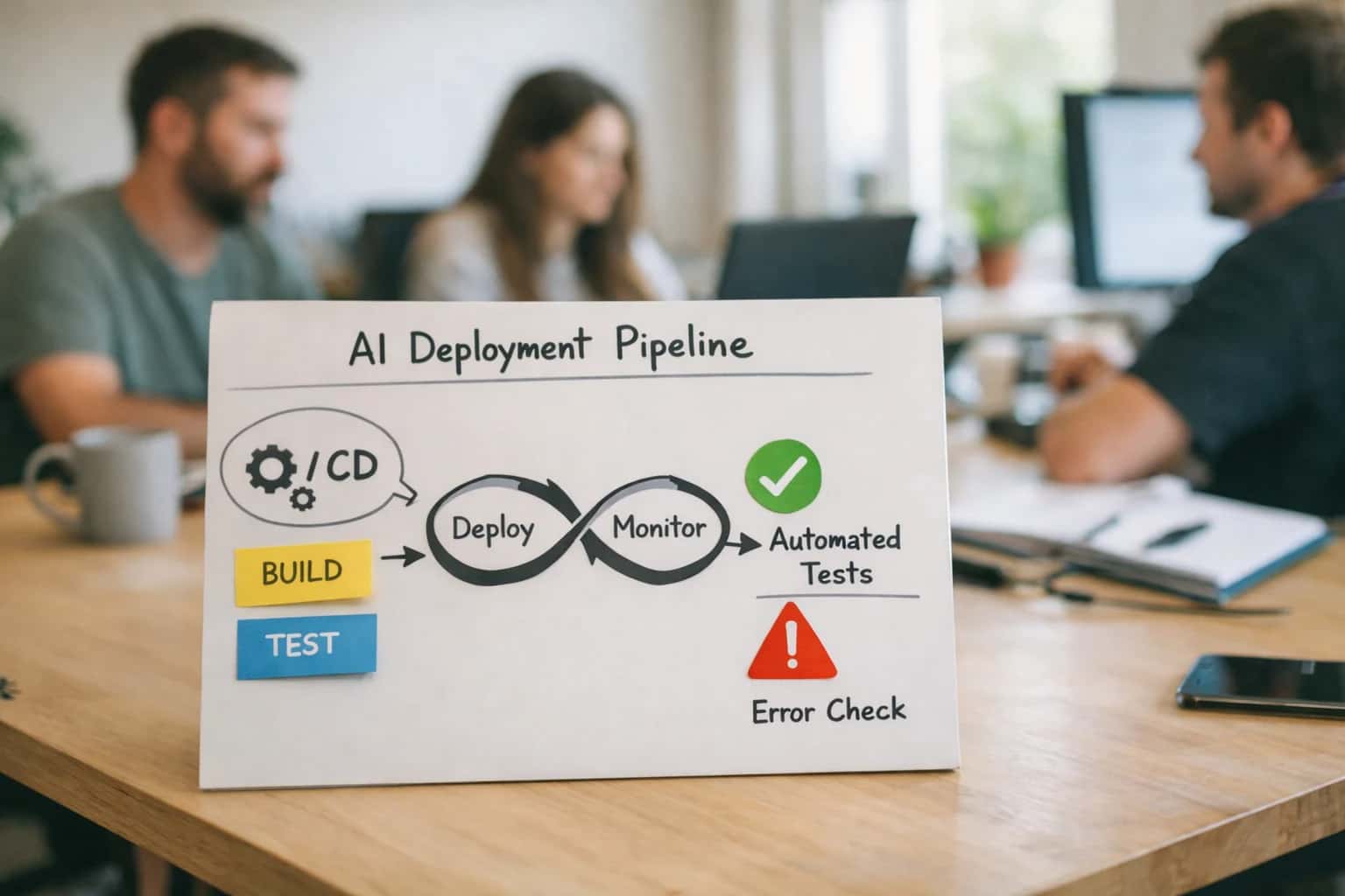
ARCHITECTURE & ROLLOUT
From Model to Dashboard: Closing the AI-BI Gap
A practical guide to operationalizing machine learning predictions by serving them securely to Tableau, Power BI, or Looker dashboards for business user consumption.
A typical implementation uses a scheduled orchestration tool (Apache Airflow, Prefect) to run inference, write results to a cloud data warehouse (Snowflake, BigQuery, Databricks SQL), and then refresh the BI platform's live connection or extracted source. For real-time use cases, you can stream predictions via Kafka or Event Hubs into the warehouse or use direct REST API calls to push data to Power BI Datasets or Tableau Server. Governance is critical: implement RBAC scoping so users only see predictions they are authorized for, and maintain an audit log linking dashboard views back to the model version and inference timestamp that generated the score.
Roll this out incrementally. Start with a single, high-impact model—like a customer churn score or inventory demand forecast—and a pilot dashboard for a specific operations team. Use this to validate the latency, accuracy, and usability of the integrated view before scaling. The final architecture should treat the BI dashboard not as a static report, but as the primary consumption layer for a live, governed AI inference service, closing the loop between data science and business operations.
ARCHITECTURE PATTERNS
Integration Surfaces: Where Models Meet Dashboards
Connect Models to Native BI APIs
The most direct method for deploying model outputs is via the BI platform's native REST API. This involves writing a service that pushes predictions as new rows or updates existing records in the underlying dataset.
Common Patterns:
- Tableau: Use the Tableau Server REST API to publish a
.hyperextract containing prediction scores. Schedule a refresh to update the data source. - Power BI: Push data to a Power BI dataset via the Power BI REST API's
PostRowsInGroupendpoint. This updates the model in near real-time. - Looker: Use the Looker API to write results to a dedicated "predictions" table in your database, which is then exposed as a Looker Explore.
Key Consideration: This pattern requires managing authentication (OAuth, service principals), handling API rate limits, and ensuring data freshness aligns with dashboard refresh schedules.
FROM BATCH REPORTS TO ACTIONABLE INTELLIGENCE
High-Value Use Cases for Model-Enabled Dashboards
Moving from static dashboards to intelligent, model-driven interfaces requires connecting ML pipelines to BI consumption layers. These patterns show where to inject predictions, scores, and AI-generated insights directly into Tableau, Power BI, and Looker to drive operational decisions.
01
Predictive KPI Dashboards
Serve machine learning forecast outputs (e.g., next-month revenue, customer churn risk, inventory demand) as new data fields in your BI semantic layer. This transforms historical dashboards into forward-looking tools for sales, finance, and supply chain teams.
Batch → Real-time
Forecast refresh
02
Automated Commentary & Narrative Generation
Attach LLM-generated, context-aware explanations to key charts and metric movements. Systems consume dashboard metadata and underlying data slices to produce plain-English summaries of why a KPI changed, reducing manual analysis for report consumers.
1 sprint
To pilot
03
Anomaly Detection & Alerting
Integrate statistical or ML anomaly detection models with your BI platform's alerting system. When a model flags an outlier in a key metric (e.g., sudden drop in conversion rate), automatically trigger a dashboard annotation, Slack alert, or create a Jira ticket for investigation.
Hours -> Minutes
Detection latency
04
Prescriptive Action Recommendations
Extend dashboards from insight to action. Embed model-generated recommendations (e.g., 'Contact these 5 at-risk accounts,' 'Reorder SKU #4521') as interactive dashboard elements. Clicking a recommendation can trigger a workflow in a connected system like Salesforce or NetSuite via webhook.
Same day
Impact cycle
05
Dynamic Segmentation & Cohort Analysis
Deploy clustering or classification model scores to create live, model-driven segments within dashboards. Instead of static filters, business users can explore data by AI-identified customer cohorts, product groupings, or risk categories that update as new data is scored.
06
Data Quality & Drift Monitoring Dashboards
Operationalize ML monitoring by serving data drift, concept drift, and model performance metrics to a dedicated governance dashboard. This gives data science and business teams a single pane of glass to track model health and ensure dashboard insights remain reliable.
Batch → Real-time
Monitoring
AI MODEL DEPLOYMENT TO BI DASHBOARDS
Example Workflows: From Batch Scoring to Real-Time Alerts
Deploying machine learning models is only the first step. The real value is operationalizing predictions for business users. These workflows show how to securely serve model outputs to Tableau, Power BI, and Looker dashboards, turning data science into daily decisions.
Trigger: Scheduled nightly ETL job completes in the data warehouse (e.g., Snowflake, BigQuery).
Context/Data Pulled: An orchestration tool (e.g., Airflow, dbt Cloud) calls a batch inference API endpoint, passing identifiers for the day's customer, transaction, or inventory records.
Model or Agent Action: A pre-trained model (e.g., churn risk, LTV forecast, inventory demand) runs predictions on the batch. Results are written back to a dedicated table in the warehouse (e.g., analytics.model_scores).
System Update: The BI platform's dataset (Power BI Dataset, Looker Explore, Tableau Extract) is refreshed on a schedule. New calculated fields or measures are created to surface the prediction scores and confidence intervals.
Human Review Point: The dashboard includes a disclaimer and a link to a detailed report showing the top 10 highest-risk predictions for a business analyst to review before any outreach actions are taken.
FROM MODEL TO DASHBOARD
Implementation Architecture: The Four-Layer Pipeline
A production-ready pipeline to serve machine learning predictions securely to Tableau, Power BI, or Looker for business user consumption.
Operationalizing a model requires a secure, governed pipeline that moves predictions from your data science environment into the semantic layer of your BI platform. The typical four-layer architecture consists of: 1) Model Serving Layer, where batch or real-time inference runs on platforms like Databricks, Sagemaker, or Azure ML; 2) Prediction Storage Layer, where scores are written to a dedicated table in your data warehouse (Snowflake, BigQuery, Redshift) with proper versioning and lineage; 3) Semantic Integration Layer, where predictions are joined to business dimensions (e.g., customer_id, product_sku, date) and exposed as a dataset or live connection in Tableau Server, Power BI Service, or Looker; and 4) Consumption & Action Layer, where business users interact with predictions via dashboards, and optionally trigger workflows back to operational systems like Salesforce or NetSuite.
Key implementation details include managing prediction freshness (scheduled batch vs. streaming), access control (ensuring RBAC from the warehouse propagates to the BI platform), and explainability (linking prediction scores to feature attribution or model cards). For example, a churn risk score in Power BI would be served from an Azure Synapse table, refreshed nightly, and visualized alongside customer lifetime value and support ticket history. In Looker, a propensity_to_buy prediction becomes a derived column in an Explore, allowing sales ops to filter and segment leads directly. Governance is enforced through audit logs tracking who accessed which predictions and when, and version control for model retraining cycles to prevent dashboard drift.
Rollout follows a phased approach: start with a single high-impact KPI (e.g., inventory_stockout_risk) in a pilot dashboard for a trusted team. Instrument usage analytics to see which predictions drive action. Then, scale the pipeline by templating the ingestion pattern and establishing a center of excellence for MLOps-BI collaboration. The goal is not just to visualize a score, but to close the loop—connecting the insight in the dashboard to a recommended action, like a next_best_offer in Marketo or a maintenance_work_order in SAP EAM. For a deeper dive on connecting these insights to operational workflows, see our guide on Action-Oriented Dashboards with AI.
AI MODEL DEPLOYMENT PATTERNS
Code & Payload Examples
Scheduled Model Inference to BI Table
This pattern involves running machine learning models on a schedule (e.g., nightly), writing predictions to a database table, and refreshing the BI dashboard's data source. It's ideal for non-real-time use cases like customer churn scores, lead propensity, or inventory demand forecasts.
Typical Architecture:
- A scheduled job (Airflow, Prefect) triggers the model inference pipeline.
- The pipeline reads features from the data warehouse, runs the model (scikit-learn, XGBoost, custom PyTorch), and writes scores with a unique key (e.g.,
customer_id,product_sku) and aprediction_timestampto a dedicated table in Snowflake, BigQuery, or SQL Server. - The BI dashboard (Power BI Dataset, Looker Explore, Tableau Extract) is configured to refresh from this table, making new scores available to business users.
Key Consideration: Ensure the refresh cadence of the BI tool aligns with the inference schedule and user expectations.
AI MODEL DEPLOYMENT TO BI DASHBOARDS
Realistic Time Savings & Business Impact
This table illustrates the operational impact of automating the pipeline from machine learning models to business intelligence dashboards, comparing manual processes to AI-integrated workflows.
| Workflow Stage | Before AI Integration | After AI Integration | Implementation Notes |
|---|---|---|---|
Model Score Generation | Manual SQL queries or script execution | Automated API calls from model registry | Scheduled or event-triggered, ensuring fresh data |
Data Preparation for BI | Manual transformation and joining in ETL | Automated schema mapping and payload formatting | AI handles data type conversion and BI field mapping |
Dashboard Data Refresh | Manual dataset refresh or upload | Automated push to BI dataset API | Near real-time updates replace daily batch processes |
Insight Generation | Analyst manually interprets charts | AI auto-generates narrative commentary for KPIs | Human review loop for high-stakes metrics remains |
Anomaly Alerting | Manual monitoring of dashboard thresholds | AI detects outliers and triggers automated alerts | Alerts routed to Slack, Teams, or incident systems |
Governance & Lineage Tracking | Manual documentation of data flows | Automated metadata capture and impact analysis | AI logs model versions, refresh times, and data sources |
User Support & Training | Help desk tickets for dashboard questions | Embedded AI copilot answers user queries | Reduces basic support load, escalates complex issues |
ARCHITECTING FOR PRODUCTION
Governance, Security, and Phased Rollout
Deploying AI model outputs to BI dashboards requires a secure, governed pipeline that business users can trust.
A production pipeline typically connects your MLOps platform (like Databricks, SageMaker, or Azure ML) to your BI platform's data source (e.g., a Snowflake table, Azure SQL DB, or BigQuery dataset). Model scores are written as new columns or tables, which Power BI, Tableau, or Looker then consume via a direct query or scheduled refresh. Critical governance steps include:
- RBAC and Data Masking: Ensure BI platform row-level security (RLS) rules are applied to the prediction data, so users only see scores for accounts or regions they are authorized to view.
- Audit Trails: Log all model inference runs, data writes to the warehouse, and dashboard access events to trace any insight back to its source model and data snapshot.
- Version Control: Tag prediction data with the model version ID and training date, allowing dashboards to reference a specific, approved model iteration.
Roll this out in phases to build confidence and manage risk. Start with a pilot dashboard for a single team, using a non-critical metric. For example, deploy a churn propensity score to a Tableau dashboard used by a handful of customer success managers. Use this phase to validate:
- Latency: Does the refresh cycle (hourly/daily) meet the operational need?
- Interpretability: Do the dashboards include clear documentation on what the score means and its confidence interval?
- Feedback Loop: Is there a mechanism for users to flag incorrect predictions, feeding data back to retrain the model?
- Performance Impact: Monitor query costs and dashboard load times with the new prediction data joined.
For broader rollout, establish a model review board—a lightweight governance group with reps from data science, BI, and the business domain. This board approves which models graduate from pilot to production, ensuring they have passed validation for bias, drift, and business impact. Finally, integrate monitoring directly into the BI ecosystem. Use tools like Tableau's Metrics or Power BI's Data Activations to set alerts on prediction confidence thresholds or significant score shifts, turning static dashboards into active decision-support systems.
Enabling Efficiency, Speed & Accuracy
Intelligent Analysis, Decision & Execution
We build AI systems for teams that need search across company data, workflow automation across tools, or AI features inside products and internal software.
Talk to Us
Search across company data
Give teams answers from docs, tickets, runbooks, and product data with sources and permissions.
Useful when people spend too long searching or get different answers from different systems.
Enterprise searchRAGPermissions
Read more
Automate internal workflows
Use AI to route work, draft outputs, trigger actions, and keep approvals and logs in place.
Useful when repetitive work moves across multiple tools and teams.
AI agentsWorkflow automationGovernance
Read more
Add AI to products and internal tools
Build assistants, guided actions, or decision support into the software your team or customers already use.
Useful when AI needs to be part of the product, not a separate tool.
AI integrationDecision supportModel routing
Read moreAI MODEL DEPLOYMENT TO BI DASHBOARDS
Frequently Asked Questions
Practical questions for teams architecting pipelines to serve machine learning predictions to Tableau, Power BI, and Looker for business consumption.
A production architecture typically involves several key components:
- Model Serving Layer: Your trained model is deployed via an API endpoint (e.g., using MLflow, Seldon Core, Azure ML, or SageMaker Endpoints).
- Orchestration & Inference Pipeline: A scheduler (like Apache Airflow) or event-driven process (using Kafka) triggers batch inference on new data, or the BI tool calls a real-time API.
- Results Storage: Predictions and scores are written to a dedicated table in your data warehouse (Snowflake, BigQuery, Redshift) or data lake.
- BI Integration: The dashboard (Tableau, Power BI, Looker) connects to this results table as a direct data source or via a semantic layer (LookML).
Key Consideration: For real-time dashboards, you may implement a live API call from the BI tool using a Web Data Connector (Tableau) or Power BI API call, but this requires careful management of latency, cost, and rate limits.

About the author
Prasad Kumkar
CEO & MD, Inference Systems
Prasad Kumkar is the CEO & MD of Inference Systems and writes about AI systems architecture, LLM infrastructure, model serving, evaluation, and production deployment. Over 5+ years, he has worked across computer vision models, L5 autonomous vehicle systems, and LLM research, with a focus on taking complex AI ideas into real-world engineering systems.
His work and writing cover AI systems, large language models, AI agents, multimodal systems, autonomous systems, inference optimization, RAG, evaluation, and production AI engineering.
LinkedIn
Limited slotsGet a Free AI Consultation
Partnered with leading AI, data, and software stack.





How We Work
Custom AI workflows for your Business
One-fit-all AI don't work for modern businesses. At Inferensys, we aim to understand your business & custom requirements; which we use to define most efficient agentic workflows, the data, and the tools for your business.
01
Review the use case
We understand the task, the users, and where AI can actually help.
Read more02
Pick the right approach
We define what needs search, automation, or product integration.
Read more03
Build the first useful version
We implement the part that proves the value first.
Read more04
Improve from there
We add the checks and visibility needed to keep it useful.
Read moreThe first call is a practical review of your use case and the right next step.
Talk to Us