Temporal Knowledge Graph Visualization is the application of information visualization techniques to render the structure and evolution of a temporal knowledge graph (TKG). It transforms time-annotated entities and relationships—often stored with temporal validity intervals—into interactive diagrams, animations, or timeline-based views. The core challenge is to effectively communicate not just the graph's static topology, but also how nodes, edges, and their properties change across defined time points or continuous intervals, making temporal patterns comprehensible.

Glossary
Temporal Knowledge Graph Visualization
The techniques and tools used to visually represent the evolution of a knowledge graph over time, often using animations, timelines, or small multiples to show state changes.
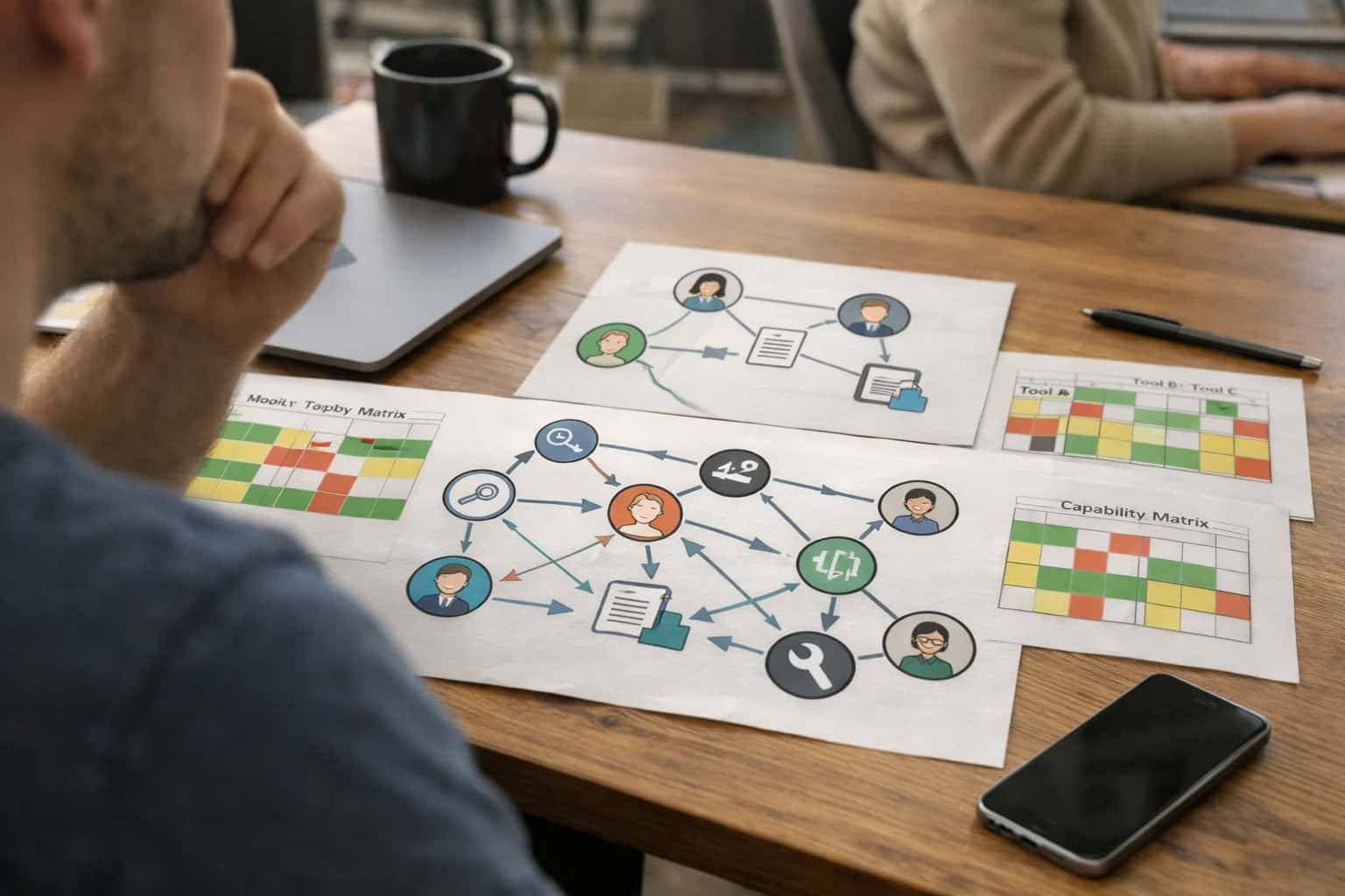
DATA VISUALIZATION
What is Temporal Knowledge Graph Visualization?
The specialized practice of creating visual representations of knowledge graphs that evolve over time, enabling the analysis of dynamic relationships and entity states.
Common techniques include animated graph layouts that show state transitions, small multiples displaying graph snapshots at different times, and integrated timeline views that map entity lifespans or event sequences. These visualizations are critical for tasks like temporal pattern mining, anomaly detection, and temporal reasoning, allowing data scientists to intuitively validate models, track provenance, and uncover causal or evolutionary relationships within complex, time-varying data.
TEMPORAL KNOWLEDGE GRAPH VISUALIZATION
Core Visualization Techniques
Visualizing temporal knowledge graphs requires specialized techniques to represent the evolution of entities, relationships, and facts over time. These methods move beyond static graph layouts to incorporate time as a primary visual dimension.
02
Small Multiples & Comparative Snapshots
This method displays a grid of static graph snapshots, each representing the graph's state at a different, discrete point in time (e.g., Q1, Q2, Q3, Q4).
- Key Use: Enabling direct visual comparison of graph structure across different epochs or time intervals.
- Advantage: Avoids the cognitive load of animation and allows for side-by-side analysis.
- Best Practice: Use a consistent layout algorithm (like force-directed placement) across all snapshots to maintain a stable mental map for the viewer.
04
3D Visualization with a Time Axis
This approach adds a third, orthogonal axis to a 2D graph layout, explicitly representing time. The X and Y axes might represent a force-directed layout of entities, while the Z-axis represents the timeline.
- Key Use: Providing an explicit spatial metaphor for temporal progression, where 'depth' equals 'past' and 'height' equals 'future' (or vice-versa).
- Entity Lifelines: Nodes become vertical lines or tubes stretching through time, with branches representing relationship changes.
- Limitation: Can suffer from occlusion and requires interactive rotation for effective analysis.
05
Temporal Heatmaps & Adjacency Matrices
This technique uses a heatmap where one axis represents entities, another axis represents time intervals (e.g., days), and the color intensity represents a metric—such as the number of active relationships for an entity in that interval.
- Key Use: Identifying periods of high activity or inactivity for specific entities.
- Temporal Adjacency Matrix: A specialized form showing the strength of connections between entities over time, revealing how relationship intensities wax and wane.
06
Focus+Context with a History Lens
This interactive method shows the current state of the graph in full detail (the 'focus') while simultaneously providing a summarized historical context. The context might be a mini-timeline, a sparkline of node degree over time, or a list of recent state changes for a selected node.
- Key Use: Understanding the present graph state in light of its recent evolution without leaving the current view.
- Implementation: Often uses tooltips, side panels, or brushing and linking between a main graph view and a separate timeline widget.
VISUALIZATION TECHNIQUES
How Temporal Graph Visualization Works
Temporal Knowledge Graph Visualization is the practice of rendering time-evolving graph data to reveal patterns, trends, and state transitions that are not apparent in static snapshots.
Temporal Knowledge Graph Visualization transforms time-annotated graph data into visual representations that communicate evolution. Core techniques include timeline views plotting entity states over time, animation showing smooth transitions between graph states, and small multiples displaying discrete time-slices side-by-side for comparison. These methods allow analysts to visually track entity lifecycles, relationship dynamics, and the propagation of events or influence through the network.
Effective visualization requires mapping temporal attributes—like validity intervals or event timestamps—to visual variables such as position, color, or opacity. Tools often integrate with temporal graph databases and support temporal querying to filter views by specific windows. The goal is to support temporal pattern mining and anomaly detection by making complex, multi-dimensional temporal dependencies intuitively comprehensible, bridging the gap between raw temporal data and human analytical reasoning.
TEMPORAL KNOWLEDGE GRAPH VISUALIZATION
Enterprise Use Cases and Applications
Visualizing temporal knowledge graphs transforms complex, time-evolving data into actionable insights. These applications enable enterprises to audit processes, forecast trends, and understand causality by making the dimension of time visually explicit and interactive.
02
Financial Fraud Investigation
Mapping the temporal sequence of transactions and entity relationships to uncover sophisticated fraud patterns. Analysts use temporal visualization to:
- Reconstruct money laundering networks by showing the formation and dissolution of accounts and transaction edges over specific windows.
- Apply temporal sliding windows to isolate high-activity periods for focused investigation.
- Detect temporal anomalies where the speed or timing of relationship formation deviates from historical norms.
- Correlate events across multiple entities (e.g., simultaneous account openings followed by rapid fund transfers). This visual audit trail is critical for regulatory reporting and understanding the provenance of fraudulent activities.
03
Clinical Timeline & Patient Journey
Creating an integrated, visual timeline of a patient's medical history from disparate EHR data. This application:
- Unifies events (diagnoses, lab results, medications, procedures) as nodes on a shared timeline, with edges showing causal or correlative links.
- Enables small multiples visualization to compare disease progression across patient cohorts.
- Supports temporal querying (e.g., 'Show all medications administered within 48 hours post-surgery').
- Highlights treatment efficacy by visualizing biomarker trends (e.g., HbA1c levels) alongside medication intervals. This transforms episodic records into a continuous temporal narrative, directly supporting personalized medicine and clinical trial analysis.
05
Corporate Knowledge & Document Evolution
Tracking the lineage and temporal context of policies, contracts, and strategic decisions. This application:
- Visualizes document version graphs, showing branching, merges, and derivative works over time.
- Maps the temporal validity intervals of contractual clauses or compliance regulations.
- Shows the evolution of organizational structure (reporting lines, team creation/dissolution) via an animated node-link diagram.
- Links decisions to meeting minutes and supporting data across time, creating an audit-ready knowledge trail. This turns a static corporate wiki into a temporal knowledge graph, making the rationale behind key business decisions explicit and traceable.
06
Predictive Maintenance & Asset Lifecycle
Modeling industrial equipment as temporal entities with evolving health states and event histories. Engineers use visualization to:
- Plot sensor telemetry (vibration, temperature) as time-series properties of asset nodes, correlated with maintenance events.
- Identify temporal patterns leading to failure (e.g., a specific sequence of operational states).
- Visualize the propagation of stress or wear through a physical system's graph model over time.
- Schedule interventions by inspecting the remaining validity intervals of component certifications or wear-life estimates. This direct visual feedback loop is foundational for transitioning from schedule-based to condition-based maintenance strategies.
COMPARISON MATRIX
Tools and Libraries for Temporal Graph Visualization
A feature comparison of leading open-source and commercial libraries for visualizing the evolution of temporal knowledge graphs and dynamic graphs.
| Feature / Metric | Gephi (with plugins) | KeyLines / ReGraph | Cytoscape.js (with extensions) | yFiles |
|---|---|---|---|---|
Native Temporal Data Model | ||||
Animated Timeline Playback | ||||
Small Multiples / State Snapshots | ||||
Temporal Filtering & Sliding Window | ||||
Temporal Layout Algorithms (e.g., Temporal Force-Directed) | ||||
Integration with Temporal Graph DBs (e.g., Neo4j with APOC) | ||||
Web-Based / JavaScript Library | ||||
Commercial License Required | ||||
Typical Learning Curve | Medium | Low | High | Medium |
Support for Event-Centric Graphs | ||||
Export Animated Visualizations (e.g., MP4, GIF) | ||||
Community Plugin Ecosystem |
TEMPORAL KNOWLEDGE GRAPH VISUALIZATION
Frequently Asked Questions
This FAQ addresses common technical questions about visualizing the evolution of knowledge over time. It covers core techniques, tools, and challenges in representing time-varying facts, entity states, and relationships within a graph structure.
Temporal Knowledge Graph Visualization is the set of techniques and tools used to visually represent the evolution of a knowledge graph over time, where nodes, edges, and their properties are associated with temporal validity intervals. It is critically important because static graph visualizations fail to capture the dynamic nature of real-world data, such as evolving company structures, changing product inventories, or historical event sequences. Effective visualization enables data scientists and domain experts to intuitively perceive patterns, trends, and anomalies in temporal data, facilitating tasks like temporal anomaly detection, temporal pattern mining, and temporal reasoning. Without it, understanding the lifecycle of entities and the causality between events becomes an abstract, query-driven exercise.
Enabling Efficiency, Speed & Accuracy
Intelligent Analysis, Decision & Execution
We build AI systems for teams that need search across company data, workflow automation across tools, or AI features inside products and internal software.
Talk to Us
Search across company data
Give teams answers from docs, tickets, runbooks, and product data with sources and permissions.
Useful when people spend too long searching or get different answers from different systems.
Enterprise searchRAGPermissions
Read more
Automate internal workflows
Use AI to route work, draft outputs, trigger actions, and keep approvals and logs in place.
Useful when repetitive work moves across multiple tools and teams.
AI agentsWorkflow automationGovernance
Read more
Add AI to products and internal tools
Build assistants, guided actions, or decision support into the software your team or customers already use.
Useful when AI needs to be part of the product, not a separate tool.
AI integrationDecision supportModel routing
Read more
About the author
Prasad Kumkar
CEO & MD, Inference Systems
Prasad Kumkar is the CEO & MD of Inference Systems and writes about AI systems architecture, LLM infrastructure, model serving, evaluation, and production deployment. Over 5+ years, he has worked across computer vision models, L5 autonomous vehicle systems, and LLM research, with a focus on taking complex AI ideas into real-world engineering systems.
His work and writing cover AI systems, large language models, AI agents, multimodal systems, autonomous systems, inference optimization, RAG, evaluation, and production AI engineering.
LinkedIn
Limited slotsGet a Free AI Consultation
Partnered with leading AI, data, and software stack.





How We Work
Custom AI workflows for your Business
One-fit-all AI don't work for modern businesses. At Inferensys, we aim to understand your business & custom requirements; which we use to define most efficient agentic workflows, the data, and the tools for your business.
01
Review the use case
We understand the task, the users, and where AI can actually help.
Read more02
Pick the right approach
We define what needs search, automation, or product integration.
Read more03
Build the first useful version
We implement the part that proves the value first.
Read more04
Improve from there
We add the checks and visibility needed to keep it useful.
Read moreThe first call is a practical review of your use case and the right next step.
Talk to Us